Brand
The Insurance Group brand.
Everything a print shop, sign maker, advertising partner, or new hire needs to use the mark correctly: the approved files, the colors, the type, and the rules. Version 1.0, issued September 4, 2026, for review by the owners.
The rule that prevents most mistakes
Choose the lockup by the shape of the space. Choose the theme by the background color. Choose the file format by the medium. Then do not modify anything. Send outsiders two things: the brand guide and the specific file they need. Nothing else leaves the building.
The only artwork the agency had was a 736-pixel JPG. Nothing on this page was traced from it. The typefaces were identified, the letters re-set from the real font outlines at the measured sizes, and the box and plate redrawn to the measured proportions. The JPG is retired.
Logo files
Every artwork below is available as SVG for screens, PDF for print and sign shops, and PNG with a transparent background for everything else. File names follow one pattern, tig-[lockup]-[theme]. If a file name does not match that pattern, it is not an approved file.
Horizontal logo
The default. Business cards, letterhead, print ads, the office sign, anything on white or paper.






Two-line logo
Wide, shallow spaces: letterhead headers, vehicle doors, banners.








Inline logo
Short, wide strips: website header, email signatures, sponsor banners.






Stacked logo
Square-ish spaces: social posts, ad squares, a shirt back.




The mark
The IG box with its gray plate, as drawn. The flat version drops the plate for small sizes, dark backgrounds, and embroidery.






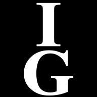
The square tile
Avatars, favicons, app tiles, and directory listings. Built so the letters survive a circle crop.




Wordmark
Rare. For when the box would be too small to read or already appears elsewhere on the piece. Three lines, two, or one.










Clear space and minimum size
Minimum clear space on all four sides is 25 percent of the height of the box, measured from the plate on the left and bottom. If the box is one inch tall, keep a quarter inch clear all the way around. For every lockup, measure from the box, not from the words. This applies to type, rules, photo edges, the edge of a sign panel, and the trim line of a printed piece.
| Use | Minimum, by box height |
|---|---|
| Horizontal, two-line, and stacked logos in print | 0.5 in |
| Inline logo in print | 0.375 in |
| Flat mark in print | 0.25 in |
| Square tile in print | 0.2 in |
| Horizontal, two-line, and stacked logos on screen | 40 px |
| Inline logo on screen | 32 px |
| Flat mark on screen | 20 px |
| Square tile on screen | 16 px, the favicon |
| Embroidery | Flat mark only, box 1 in tall, one-color file. The condensed wordmark does not embroider. |
Never
- Stretch or squash. Scale both dimensions together.
- Rotate, tilt, or set on an angle.
- Recolor. The maroon is fixed.
- Put the full-color logo on a maroon field. The box vanishes. Use the white one-color file there.
- Place it on a busy or clashing background.
- Add a second shadow, a glow, a bevel, or an outline. The plate is the only shadow.
- Retype the name. The words in the logo are outlined artwork, not live text. Setting the name in Times New Roman next to the box is not the logo.
- Rebuild the box. The proportions, the tightness of the G, and the plate offset are fixed.
- Use the old JPG, a screenshot, or a copy pulled off Facebook. Ask for the file.
- Put the logo inside a circle, badge, or rounded box. The box is already the container; the square tile exists for the one case that needs it.
- Add a tagline, a year, a slogan, or a service list inside the clear space.
Color
One maroon does the work. The gray exists only to be the plate. Everything else is a neutral. Resist adding a second brand color, and never substitute a close maroon because a press or a supplier finds it easier. No Pantone number has been assigned; for offset work, match the maroon to a proof rather than to the numbers.
#5D111ERGB 93 17 30 · CMYK 0 / 82 / 68 / 64The brand color. The box, headlines, buttons, rules.
#A6A6A6RGB 166 166 166 · CMYK 0 / 0 / 0 / 35The plate behind the box. Never for text, never anywhere else.
#000000RGB 0 0 0 · CMYK 0 / 0 / 0 / 100The wordmark on light backgrounds. Body text in print.
#FFFFFFRGB 255 255 255 · CMYK 0 / 0 / 0 / 0The letters inside the box. The wordmark on dark backgrounds.
#F7F3ECRGB 247 243 236 · CMYK 0 / 2 / 4 / 3The light background on the website. Warmer than plain white, and intentional.
#1B1512RGB 27 21 18 · CMYK 0 / 22 / 33 / 89Dark surfaces on the website. Body text on paper.
#A87B3ARGB 168 123 58 · CMYK 0 / 27 / 65 / 34Website detail only: thin rules, numerals, small accents. Never in the logo, never for small text on light.
#360A11RGB 54 10 17 · CMYK 0 / 81 / 69 / 79Pressed and hover states on the website. Never in print.
Which pairs are legible
Measured contrast ratios. The threshold for normal-size text is 4.5 to 1.
| Combination | Ratio | Verdict |
|---|---|---|
| Maroon on white | 13.42 : 1 | Use freely. Headlines, buttons, the box. |
| White on maroon | 13.42 : 1 | Use freely. The inside of the box, and the correct way to set type on a maroon panel. |
| Maroon on paper | 12.14 : 1 | Use freely. |
| Ink on paper | 16.33 : 1 | Body text on the website. |
| Brass on ink | 4.78 : 1 | Passes. Brass text is acceptable on dark surfaces only. |
| Brass on white | 3.78 : 1 | Fails for text. Rules, numerals over 18 pt, and decoration only. |
| Plate gray on white | 2.43 : 1 | Fails. The gray is a shape, never a text color. |
| Maroon on ink | 1.35 : 1 | Fails. Never set maroon type on a dark surface. |
Typography
The letters in the logo are outlined artwork: Times New Roman, condensed, emboldened, and converted to paths. There is no font file and no live text. Scale it, do not set it. Everything around the logo is set in two typefaces, both free from Fontshare and both already in use on this website.
- Headlines: Zodiak Bold. Sentence case. Tight letter spacing at large sizes. Not all caps for long headlines.
- Body and interface: Switzer. Regular for body, Medium and Semibold for emphasis and labels.
- If they are unavailable in Word, Outlook, or a vendor's software: Georgia for headlines and Arial for body. Never Times New Roman for text near the logo, and never condensed, script, or decorative faces.
Zodiak on Fontshare · Switzer on Fontshare
How to write our contact information
| Item | Write it as |
|---|---|
| Name | The Insurance Group. Always with "The", never "TIG" or "IG" in text. |
| Office | 1050 N 18th Street, Clinton, IA 52732 · Monday to Friday, 8:00 AM to 5:00 PM |
| Phone and fax | (563) 242-4000 · fax (563) 242-6973 |
| Web | theinsgroup.org · facebook.com/TheInsGrp |
Which file to send
Most brand damage happens at this step. Someone needs a logo, grabs whatever is nearest, and a soft copy with a white box ends up on a sign. Match the medium to the format.
| Medium | Format | Which file, and why |
|---|---|---|
| Sign shop, vehicle, banner | Vector, scales to any size, opens straight into Illustrator. Horizontal or two-line logo. For cut vinyl, send the one-color file: the letters are already cut out of the box. | |
| Commercial print: cards, letterhead, folders, ads | Same file. Tell the printer the CMYK build below, that no Pantone is assigned, and that the maroon is to be matched to a proof. | |
| Website and email signature | SVG | Smallest and sharpest at every screen size. The inline logo for headers and signatures, the square tile for the favicon. |
| Social profile and avatar | PNG | The square tile. Most platforms crop to a circle, and the tile is built so the letters survive that crop. |
| Word, Google Docs, slides | PNG | Transparent background, so it sits on any slide color without a white box. Pick on-light or on-dark by the slide. |
| Embroidery and screen print | Flat mark, one color, vector only. Never let a shop digitize from a PNG or a photo of a shirt. | |
| Third-party directory: Google, BBB, chamber, carrier locators | PNG | Square tile as supplied. Where a wide logo is required, the inline logo on light. |
Ask before you print
Nothing carrying The Insurance Group name goes to production without someone looking at a proof. That habit costs a day and saves reprints.
- Request the file. Contact The Insurance Group with the medium and the finished size. Do not use a file you already have on hand unless you can confirm it came from this kit.
- Send a proof back. A PDF proof, a photo of a sample, or a screen mockup. For anything installed on the building or a vehicle, we want to see it before it is cut.
- Get written approval. Email is enough. Approval comes from Mark Mangler or Drew Mangler. Verbal approval over the counter does not count.
- Send back the final artwork. Whatever the shop produced goes back into the brand folder so the next vendor starts from the right file.
The logo carries no registered or trademark symbol, and none is to be added.
Version
| Document | The Insurance Group, Brand and Identity Standards |
| Current version | Version 1.0, issued September 4, 2026, for review by the owners |
| Owner | The Insurance Group |
| Approver | Mark Mangler and Drew Mangler, Owners |
| Review cycle | Annually, or on any change to the logo, colors, address, phone numbers, or ownership |
| Superseded versions | Not valid for production. A major version retires every earlier version. |
Questions, files, or approvals: The Insurance Group, (563) 242-4000.